Wednesday, November 26, 2014

Armando Testa

This week, the reading opened up with a mention of Armando Testa. Although there was only a small discussion of his work, I found myself intrigued to learn more about the artist "considered the father of modern Italian advertsing" (Aslanadis, 2014).

By the age of 14, Testa had already tried several apprenticeships, including as a locksmith, sheet metal worker, and a typesetter. He began taking night classes at the Vigliardi Paravia School of Graphic Arts, where he was mentored by Ezio d-Errico, "a teacher at the school and one of the best known abstract artists of the day" (Tungate, 2013).  Although he won several competitions to design letterheads and leaflets, he was a difficult employee and was fired from most jobs after only a few weeks, "until by the age of 18 he had been let go by 28 different employers" (Tungate). But Testa had a breakthrough as a graphic designer in 1937 after winning a poster competition for ICI, an ink and paint manufacturer.

Source: zigposters.co.uk

In 1946, Testa opened up his own graphic design studio in his hometown of Turin, where "he began to create labels, logos, packaging, brochures, covers, and posters," initially attracting mainly small clients (AdAge, 2003). However, he soon drew larger clientele, including Martini & Rossi, Carpano, and Pirelli, for whom his tire ads received much acclaim. In his work for Carpano, Testa created a character of "King Carpano," an anthropomorphic liquor bottle who toasted famous historical figures in the advertisements.
Source: AllThingsRuffnerian.blogspot.com


Martini & Rossi ad, Source: TheAnimalarium.blogspot.com

Pirelli ad, Source: RebelsInTradition.com

In 1956, Testa, his wife, and associate Franco de Barberis founded Studio Testa, a full-service advertising agency "destined to become a leader in Italy and beyond" (Verzotti, 2001). The agency became highly active in television advertising, Testa created a stop motion video advertisement for client Lavazzo's Paulista coffee, featuring characters made of simple cones and spheres. The ads, run on Italy's late night Carosello advertising block became wildly popular, as many "Italians have fond memories of these early TV years and many of the early commercials and their characters" (AdAge, 2003).

Paulista commercial still, Source: YouTube

Perhaps as a result of his early influences, Testa maintained a strong desire to create abstract art in addition to his interest in commercial graphic design, but he was fortunate "to be able to work with clients who, like him, felt that art and commerce were not mutually exclusive" (Tungate, 2013). His love of simplicity in design may have assisted him in his success, where advertisements that quickly impart a message can be the most memorable. At a showing of his work in 1987, Testa described this inspiration and impact: "My love of synthesis - conveying a message by means of a single gesture, a simple image - and my use of white backgrounds, primary colors, and the most basic symbols of visual communication (circle, cross, diagonal, angle) have unfortunately endowed me over the years with a distinctive style, and many people recognize my work on sight.

Testa's work pulled inspiration from many areas, and his poster style definitely recalls the Plakatstil era, but he also continues to be an inspiration. A 2002 ad by his agency for Pirelli is an homage to two easily recognizable works of Testa, showing that his designs can still have a major impact even 50 years later.
Source: MosernPosterArt.blogspot.com

Source:ThePost.Pirelli.it

Source: Coloribus.net


Sources:

AdAge. (2003). Armando Testa. Retrieved from http://adage.com/article/adage-encyclopedia/armando-testa/98902/

Ruffner, M. (2012). The distinctive designs of Armando Testa. Retrieved from 

Tungate, M. (2013). Adland: A global history of advertising. Retrieved from 


Verzotti, G. (2001). Armando Testa. Retrieved from 

Monday, November 17, 2014

Akzidenz-Grotesk

The 1950s saw the development of the International Typographic Style movement, also called Swiss design. Major elements of the movement included asymmetrical organiation of elements on a grid, objective design and copy, and the use of sans-serif typography. In the latter area, the dominant font that inspired and drove the movement was not one developed during the era, but one that was created 60 years prior.

Akzidenz Grotesk was a san-serif font family released by the Berthold Foundry in 1896. It "originate[d] from Royal Grotesk light by royal type-cutter Ferdinand Theinhardt," who developed it for the Prussian Academy of Sciences in Berlin (Devroye, 2014). The fonts came in many sizes and weights that allowed for a large variety of compositions, and was seen as "a major step in the evolution of the unified and systematized type family." It  continued to be "a source of inspiration for other sans serif typefaces until the post-World War II era" (Meggs, 2006). During the Swiss design movement, two major typefaces that drew on Akzidenz Grotesk's inspiration were Univers and Helvetica. Although some of the differences were subtle, it is possible to see the many variations when the typefaces are compared side-by-side.

Source: Wikimedia Commons

During the Swiss design movement, Akzidenz Grotesk was highly favored by many designers. The most notable of the group include Joseph Muller-Bruckman and Anton Stankowski. Muller Bruckman's designs incorporated the font in many different ways, sometimes making it the major focus of the design, such as in the Der Film poster. Almost 100 years after the font was developed, Stankowski was still singing its praises, calling it his preferred font even after 60 years in the industry.

Source: 100besttypefaces.com


Many years after the end of the Swiss design movement, the typeface is still highly prevalent. It frequently ranks near the top of lists like "The Best 100 Typefaces of All Time" and "The 10 Best Fonts." The font can be seen in everything from calculators to movie posters.

Braun calculator with Akzidenz Grotesk buttons. Source: FontsInUse.com
Abraham Lincoln: Vampire Hunter movie poster. Blue font is Akzidenz Grotesk. Source: FontsInUse.com

A current designer based in Portugal was even inspired to create a sample branding project, imagining an Akzidenz Grotesk range of beers in homage to the typeface's birthplace. He created mockup bottles for different types of beers with alcohol volume based on the different weights in the original typeface.

Source: CreativeBloq.com

It is unlikely that Akzidenz Grotesk will ever go out of style or use. As one writer states, the font family "has remained popular and influential for a century now because it is regal without being pretentious, clean without being soulless...Typefaces come and go: Akzidenz Grotesk remains" (Alterio, 2014).


Sources:

Alterio, J. (2014). Kern your enthusiasm 7. Retrieved from http://hilobrow.com/2014/08/07/kern-your-enthusiasm-7/

Devroye, L. (2014). Ferdinand Theinhardt. Retrieved from http://luc.devroye.org/fonts-46521.html


H. Berthold Typefoundry. (2014). Akzidenz grotesk. Retrieved from http://www.bertholdtypes.com/blog/2010-12-08/akzidenz-grotesk/

Meggs, P.B., Purvis, A.W. (2006). Megg's history of graphic design. Hoboken, N.J.: J Wiley & Sons.

Tuesday, November 11, 2014

Degenerate Art

"This art is the production of crazy people. Pity the people who are no longer able to control this sickness." -Adolf Hitler, in reference to the Dada movement

During Hitler's tenure as the leader of Germany, art was seen as "one of the most important elements to strengthening the Third Reich and purifying the nation" (FCIT, 2013). It was considered as part of political expression and power, and Hitler preferred work that was "realistic and heroic," portraying his idea of "the true German spirit" (Trueman, 2014). However, there was a significant amount of art that did not meet with the approval of the ruling party. Modern art in particular was abhorred by the group, often referred to by "the terms Jewish, degenerate, and Bolshevik" (FCIT 2013). Art that did not meet with the party's stringent standards was targeted for destruction, and the artists who produced it could often meet with consequences. In their attempt to suppress "unsavory" art, the German government did bring about the destruction of many works of art, but also exposed a wide audience to the movement they hoped to destroy.

Entartete Kunst poster. Source: Deutsches Historiches Museum

In 1927, Germany saw the formation of the National Socialist Society for German Culture, which aimed to "halt the 'corruption of art' and inform the people about the relationship between race and art" (FCIT, 2013). By 1937, the Nazi Party conducted a purge of all the German museums, removing any art they classified as degenerate. "Thousands of so-called degenerate works were destroyed," but some were earmarked for other purposes (Schwartz, 2014). In July 1937, the German government debuted two major art shows - a huge showcase of great German art that embodied all the ideals of the ruling party, and Entartete Kunst (Degenerate Art), an "exhibit...designed to ridicule and denigrate creative works not upholding 'correct' National Socialist virtues" (Hammerstingl, 1998). 

Lines to see the Entartete Kunst show. Source: Red Wedge Magazine
This exhibit included over 650 works of various mediums, including paintings, sculptures, prints, books, and musical notations. Famous artists whose works were displayed in this exhibit include Chagall, Van Gogh, and Kandinsky. Some artists whose works were considered too inflammatory were not displayed. This included artist Kathe Kollowitz, "because her work was critical of the Nazi regime" (FCIT 2013). 
Capture of original Entarte Kunst show. Source: Judisches Museum Berlin

The work that was showcased in the exhibit was "chaotically hung with accompanying criticism and derisive text, in order to clarify to the German people what type of art was considered unacceptable" (USHMM, 2014). After the initial showing in Munich, the show traveled to other parts of Germany and Austria over the next two years, exposing the works to a wide range of people. By the end of its run, over three million people had visited the exhibit, making it "the most widely seen exhibit of modern art" (Hammerstingl, 1998).

A video of the Entartete Kunst 1937 Show. Source: YouTube.


But the end of the exhibit also saw the end of many of the abhorrent artworks. "On March 20, 1939, the Degenerate Art Commission ordered over one thousand paintings and almost four thousand watercolors and drawings burned in the courtyard of a fire station in Berlin" (Hammerstingl, 1998). Joseph Goebbels, the Nazi Minister of Propaganda from 1933 to 1945, also ordered more purging of art from German collections shortly after the exhibition, "bringing the total number of modern works seized by the Nazis to over 16,000" (USHMM, 2014).
Recent exhibit of the 1937 art shows side by side. Source: Neue Galerie New York

Ultimately, though this action led to the destruction of countless works of art, the effort to suppress modern art was unsuccessful. The actions of the Third Reich were unable to stop the progress of art, and their choices ultimately exposed a much larger audience to the artistic movement than it might have otherwise seen.


Sources:

FCIT - Florida Center for Instructional Technology. (2013). Degenerate art: Entartete Kunst. Retrieved from http://fcit.usf.edu/holocaust/arts/artDegen.htm

FCIT - Florida Center for Instructional Technology. (2013). Nazi approved art. Retrieved from 

Hammerstingl, W. (1998). Entartete Kunst. Retrieved from 

Schwartz, L. (2014). 'Degenerate' exhibit recalls Nazi war on modern art. Retrieved from 

Trueman, C. (2014). Art in Nazi Germany. Retrieved from 

USHMM - United States Holocaust Memorial Museum. (2014) 1937 Munich exhibition of degenerate art. Retrieved from http://www.ushmm.org/information/exhibitions/online-features/collections-highlights/julien-bryan/nazi-germany-1937/1937-munich-exhibition-of-degenerate-art

Tuesday, November 4, 2014

Advertising Apple: How Plakatstil Sold the iPod

When you think of Apple and the debut of the iPod, one of the first things that comes to mind is the famous silhouette advertisements. The ads are very simplified: a black silhouette of a person against a brightly colored background with a white iPod and headphones in stark contrast in the forefront of the poster. This style was used for the print and video media for the new launch, and contributed to the popularity and exposure of the item. It is heralded in some literature as being "groundbreaking" and "iconic", but it obviously owes its inspiration to the Plakatstil movement of the early twentieth century.

Source: AdMadness.com

In a fascinating twist, the iPod ads share not only the Plakatstil style, but also a similar reaction upon their first introduction to the decision makers at Apple. Graphic artists at TBWA/Chiat/Day, Apple's ad agency, created the designs in 2003, along with a number of other possibilities. Although the agency was pushing the silhouettes in particular, Steve Jobs, head of Apple, did not like the idea and "dismissed it outright" (Fiegerman, 2012). Jobs' biggest complaint was that he felt the ad "doesn't show the product...[and] doesn't say what it is" (Doyle, 2011). However, the ad agency pushed back and managed to convince him of the merits, changing his mind and causing him to move forward with the design. This mirrors the reaction to artist Lucian Bernhard's early Plakatstil poster for Priester matches. When he entered it into a competition, it was rejected outright, but one juror convinced of it's genius convinced the others to move forward, sparking a movement,

Source: Britannica.com

The Priester poster and many other works of the Plakatstil movement followed "the Bernhard formula: flat background color; large simple image; and product name" (Meggs, 2006). The iPod designs fall under the same formula but with a small twist. They are described as "never more than three distinct colors on the screen at any one time, and black and white are two of them. What makes it so bold are those vast swaths of neon monochrome" (Stevenson, 2004). In Apple's case, this formula paid off. According to one source, "the distinctive marketing art used in these ads also helped Apple to sell tens of millions of iPods...[and] in some ways, helped Apple move its business to another level" (Doyle, 2011). The iPod designs are really just a Bernhard poster with a more vibrant background color, and evidence of how old methods can prove to be incredibly successful inspirations for modern graphic designs.


Cited Sources:

Doyle, J. (2011). The iPod silhouettes: 200o - 2011. Retrieved from 
http://www.pophistorydig.com/topics/tag/tbwachiatday-advertising/

Fiegerman, S. (2012). Steve Jobs almost killed one of Apple's biggest ad campaigns. Retrieved from 


Meggs, P. B., Purvis, A.W. (2006). Megg's history of graphic design. Hoboken, N.J.: J. Wiley & Sons.

Stevenson, S. (2004). You and your shadow. Retrieved from

Tuesday, October 28, 2014

Women in Advertising: Art Nouveau's Enduring Inspiration

The female form has been incorporated into nearly every major art movement, as either subject or inspiration. In art nouveau, the female form was especially celebrated and depicted because of its organic and elegant lines, and the popular posters created during that era prominently feature females. Much of advertising history features women as a central figure in the art and media, a practice that still continues. In some ways, popular artists of the art nouveau period, such as Jules Cheret and Alphonse Mucha, could be considered the fathers of modern advertising. Their work still remains popular and heavily copied, and the use of the female form as a central or decorative feature endures. The excitement and interest their work garnered may be a key reason why the faces and bodies of women are still a major element around which many advertisements are created.

Jules Cheret has been hailed as both the "father of the modern poster" and the "father of women's liberation" (Meggs, 2006, p 201-202). He was prolific in his creation of posters and advertisements, having created over a thousand posters, and his work led to his induction into the French government's Legion of Honor. But it was the subjects of his work as much as the quality that created his popularity. Cheret once said that an advertisement "need not show its product, as long as it evoked a feeling that conveyed amusement, enchantment, or enticement toward the product" (Edwards), and he accomplished this through heavy use of beautiful women as the central focus. The women of his work were dubbed "Cherettes" and were wildly popular. But some consider the Cherettes as "an unhealthy first step towards media promoting impossible body types for women" (Stock-Allen, 2011). Cherettes were heavily idealized - women who flouted the accepted norms and wore revealing clothing and indulged in risque behaviors for women of the time. This drove their popularity amongst both men and women and spurred the use of the figures in advertisements for many items, including "beverages and alcohol, perfumes, soaps, cosmetics and pharmaceutical products. Eventually he was promoting railway companies as well as a series of manufacturing businesses" (Collins, 2008).

Cheret poster. Source: InternationalPoster.com

Another major figure in the art nouveau movement was Czech artist Alphonse Mucha, who was also known for his use of the female figure. Mucha exploded on the art scene after taking on a commission to design a poster for actress Sarah Bernhardt's new play, Gismonda. Meggs describes Mucha's figures as "project[ing] an archetypical sense of unreality. Exotic and sensuous while retaining an aura of innocence, they express no specific age, nationality, or historic period" (2006). Also like Cheret, Mucha was very prolific in the world of advertising. He frequently designed posters for the theatre, as well as "a whole host of consumable products that remain some of his most recognizable work" (Walsh, 2014).

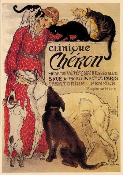
Cheret and Mucha were not the only artists of the movement to focus on female form. Most of the artists of the era incorporated it into their works either extensively or occasionally in their advertising work. The work ranged from innocent to somewhat erotic. Henri de Toulouse-Lautrec had a much smaller body of work, producing only 31 posters, but his work depicting the Moulin Rouge and cabarets of the time are iconic. Belgian designer Privat-Livemont is cited as "an excellent example of female sensuality used in the service of commerce" (Stock-Allen, 2011). Theophile-Alexandre Steinlein heavily depicted felines in his works, but did occasionally utilize women as figures, often in a less erotic, though still romantic way.

Toulouse-Lautrec. Source: hoocher.com
Privat-Livemont. Source: Wikimedia Commons
Steinlein. Source: GreatVintageGraphics.com

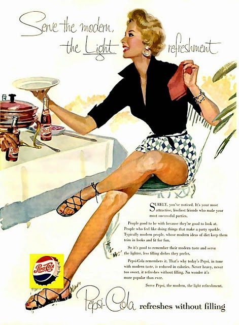
Fast forward to the pin up art popular in the 1940s and 50s and it is easy to see the source of inspiration. Artists like Gil Elvgren, Bill Randall, and Alberto Vargas drew women who show the same idealized beauty and attractive energy as their predecessors. The Cherettes were supplanted by the Gibson girls, and while advertisements changed somewhat in artistic style, they are just a variation on a theme. Beautiful women in striking poses with elegant hair and risque clothing still dominate as the central selling figure. The figure in the Pepsi ad recalls Cheret's art seen earlier, while the woman in the Claussner Hosiery ad is drawn with much of same curvilinear organic lines seen in many art nouveau works, and the Kool cigarettes woman is just a modern Job cigarettes woman.


Source: PinUpCartoonGirls.com

Source: PinUpCartoonGirls.com

Source: PinUpCartoonGirls.com

In the present, women are still a central figure in advertising, although the advertisements often verge away from the elegant artistry of earlier works into a more aggressive sexuality and in the depiction of women. Still, some of those influences remain. It is easy to see how these works owe an allegiance to the advertisements created in the art nouveau period, and merely impress new styles and accepted cultural norms onto a framework created by the likes of Cheret and Mucha.

Source: Brewbarn.Ecrater.com

Source: research-methodology.net

Source: PETA

Sources:

Collins, N. (2008). Jules Charet (1836-1932). Retrieved from http://www.visual-arts-cork.com/famous-artists/jules-cheret.htm

Edwards, E. (2008). The development of posters. Retrieved from
http://www.erinedwardsdesigns.com/dev_post/f1_d1.html

Meggs, P.B., Purvis, A.W. (2006). Meggs' history of graphic design. Hoboken, N.J.: J. Wiley & Sons.

Stock-Allen, N. (2011). Paris & the belle epoque poster craze. Retrieved from http://www.designhistory.org/Poster_pages/LaBelleEpoque.html

Walsh, G. (2014). Masters of the poster: Cheret, Mucha, and the new art of advertising. Retrieved from http://mirappraisal.com/masters-of-the-poster-cheret-mucha-and-the-new-art-of-advertising/


Tuesday, October 21, 2014

Etsy and the Arts and Crafts Movement

When the Arts and Crafts movement began in the 19th century, the founding ideal was a desire to move away from a market glutted with mass-manufactured goods and promote artistry and handmade creation. John Ruskin, a celebrated writer and artist of the era, "pointed toward the union of art and labor in service to society," and believed that artistry didn't necessarily have to serve a specific purpose, as "beautiful things were valuable and useful precisely because they were beautiful" (Meggs, p177). Although the original movement ended approximately 100 years ago, it continues to have a lasting impact. Thanks to modern technology like the internet, the world is experiencing a return to some of the beliefs espoused by its founder William Morris and proponents like Ruskin.

William Morris' work in the pursuit of his beliefs that founded the Arts and Crafts movement led to a revival in the creation of a book as an artistic pursuit instead of just a commercial one. When he found himself dissatisfied with the output of printers and the decline of design, he followed an entrepreneurial instinct and struck out to make his own press to create and distribute works of quality. His efforts gave consumers choices beyond the mass-produced items that had supplanted works created with care. Today, it is even easier for an artist to reach an audience and distribute their work. Through sites like Etsy, which describes itself as "the world's most vibrant handmade marketplace," artists can post their creations online for anyone in the world to see and purchase. Before the advent of sites like these, handmade items could only be purchased at fairs and festivals, or small shops who chose to include the work of local artists. The majority of goods available for purchase at chain stores were of the mass-produced kind. Online merchandising allows people to connect to a wider range of goods and artists, and increases the possibility of buying handmade items at a fair rice with limited hassle.

Morris would likely approve of Etsy, a company that once declared that its "mission is to enable people to make a living making things, and to reconnect makers with buyers. Our vision is to build a new economy and present a better choice: buy, sell and live handmade" (McRae, 2010). Many people who have found themselves unemployed in a difficult economy have turned to selling handmade goods as a way to make ends meet when in financial difficulty (Bassett, 2010). This would have pleased Morris and Ruskin, who were also strong proponents of social justice, wanting to see fair labor conditions and greater benefits to workers (Harvey &Press, 1991; Meggs, 2012). Sites like Etsy enable anyone to have an entrepreneurial spirit and benefit from their creations. Mass-manufactured items will always be more easily available and often have cheaper prices, but the site can allow an artist to open a "shop" with little to no overhead and a wide potential audience. Although the leaders of the Arts and Crafts movement did not like the modern technology of their era (The Economist, 2014), artists of this era have harnessed it to expound on Morris' ideals and pursue a world with a greater appreciation and creation of handmade items.

Sources:

Bassett, L. (2010) Jobless turning to Etsy to make their hobbies lucrative. Retrieved from
http://www.huffingtonpost.com/2010/10/06/etsy-online-craft-store-m_n_752791.html

Economist. (2014) The art and craft of business. Retrieved from
http://www.economist.com/news/business/21592656-etsy-starting-show-how-maker-movement-can-make-money-art-and-craft-business

Luckman, S. (2013). The aura of the analogue in a digital age: Women's crafts, creative markets and home-based labour after Etsy. Cultural Studies Review, 19(1). Retrieved from http://www.questia.com/library/journal/1P3-2984190971/the-aura-of-the-analogue-in-a-digital-age-women-s

McRae, P.S. (2010). Etsy: 21st century arts and crafts. Retrieved from
http://blackfishart.blogspot.com/2010/10/etsy-21st-century-arts-and-crafts.html

Meggs, P.B., Purvis, A.W. (2006). Meggs' history of graphic design. Hoboken, N.J.: J. Wiley &Sons.


Tuesday, October 14, 2014

Mathematics in Design

As we progress through chapters five through eight in Megg's History of Design, we start to see an increased discussion of the role of mathematics in the design process. The capitals in Griffo's Bembo type "used the one-to-ten (stroke weight to height) proportion advanced by leading mathematicians of the era." (Meggs, p104) The construction of the Romain du Roi typeface, the official typeface of King Louis XIV's Imprimerie Royale, was created by a team of scholars headed by mathematician Nicolas Jaugeon. Nineteenth century craftsman William Morris declared the development of this typeface "saw the calligrapher replaced by the engineer as the dominant typographic influence." (Meggs, p122) In the sixteenth century, mathematics professor Oronce Fine was a popular graphic designer for his "mathematical construction of ornaments" and the eighteenth century saw the development of information graphics to represent statistical data. (p113) Although people may choose to classify themselves as either right-brained or left-brained, dependent on their predisposition towards either more scientific or more artistic thinking and abilities, science and art are not mutually exclusive. Art and design can be enhanced and created through the fundamentals of science and math.

A fascinating contribution of mathematics to art and design is the golden ratio and the fibonacci sequence. The golden ratio, also known as the golden number or golden mean, is an irrational number roughly equal to 1.618. The Fibonacci sequence is a sequence of numbers, beginning with one, where each number is the sum of the two before. So the Fibonacci sequence begins with 1, 1, 2, 3, 5, 8, 13..., etc. The further one travels down the sequence, the closer the ratio between the two numbers gets to the golden ratio. The sequence can be represented visually in the form of a spiral, shown below:

Source: Wikimedia Commons
The golden ratio and the Fibonacci sequence occur commonly in nature. The number and structure of seeds, petals, and spirals in sunflowers, pinecones, and pineapples are often a Fibonacci number, and the structure of a Nautilus shell shows the Fibonacci spiral.

Source: photoshoptutorialsandtips.com
These same concepts can be applied to art and design. Meggs' text discusses how mathematics was used in designing historical typefaces, and this is still an important part of typography. But typography is not just about the construction and design of the individual letterforms. Font size, line width, line height, and the proportions between them must all be considered when creating a new typeface and using them in documents to the best effect. Many sites offer modular scales and calculators to find the best proportions for font creation and placement. In the article "More Meaningful Typography," author Tim Brown (2011) offers an in-depth look at using the golden ratio in developing a modular scale. His article explores how this affects balance and appearance in web design and creates a stronger and more pleasing visual. Designer Nick Meccia (2013) also promotes the use of the modular scale in design, explaining that "its purpose is to introduce hierarchy and consistency into typography via mathematical relationships." He adds that incorporating the Fibonacci sequence and golden ratio into designs can "elevate [the] visual impact."

Golden Ratio equation - Source: mathisfun.com
But the use of mathematics and proportion is not limited to only typography. Fine's art is just one example of an artist whose work incorporates mathematical principles to great effect. Many of the works of artists like Leonardo daVanci, Georges Surat, Salvador Dali and others have been analyzed for proportions aligned to the golden ratio, although it is not known for certain whether this was intentional in every case. Artist Edward Burne Jones did use the ratio when composing his work. "The Golden Stairs," shown below.
Source: Wikimedia Commons
With all the modern advancements in technology, incorporating principles of math and science into design becomes easier than ever. One does not need great mathematical skill or a heavy education in these topics. Readily available online tools like the modular scales and calculators and instant connection and advice from others on posting boards and listservs can improve the accessibility and use of these tools for anyone interested. While early typography and design seemed to be limited to those with great education, innate talent, or the right connections, these days, anyone with drive can find what they need to create their own works and find an audience.


Sources:

Brown, T. (2011). More meaningful typography. Retrieved from http://alistapart.com/article/more-meaningful-typography 

Hamilton, L. D. (2014). The golden ratio and typography. Retrieved from http://www.lauradhamilton.com/the-golden-ratio-and-typography

Meccia, N. (2013). Designing irrationally. Retrieved from http://blog.8thlight.com/nick-meccia/2013/08/23/designing-irrationally.html

Meisner, G. (2014). Golden ratio in art composition and design. Retrieved from http://www.goldennumber.net/art-composition-design/

Meggs, P. B., Purvis, A. W. (2006). Meggs' history of graphic design. Hoboken, N.J.: J. Wiley & Sons.

Pearson, C. (2011). Secret symphony: The ultimate guide to readable web typography. Retrieved from http://www.pearsonified.com/2011/12/golden-ratio-typography.php